Market Insights – 1Q19
Cambiar President Brian Barish discusses 1Q19 performance and details the Shallow Market Hypothesis.

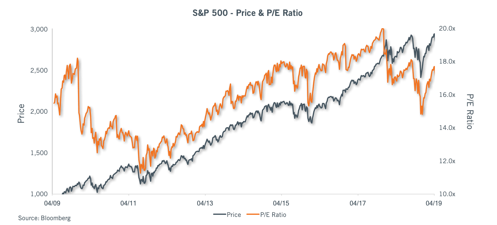
After a poor 2018 for global equities, which featured a distinct air pocket of risk aversion, valuation compression, and tax-motivated loss selling squeezed into the final days of 2018, a bit of better newsflow was bound to generate material upside. Most stocks rebounded quickly with the calendar flip, generating substantial gains in the first six weeks of the quarter after reaching blowout lows around Christmas Eve. These included gains of over 14% for U.S. small-cap stocks, 13% for large-cap stocks, and 10% for international larger and smaller cap stocks by quarter’s end, with peak levels tending to occur in mid-February. The advance was a “Beta rally” as the expression goes, with more cyclical and speculative stocks generally outperforming defensive and acyclical businesses. We would argue the aversion to cyclicality/industrial variability had become quite extreme by December 2018, with U.S. and International equity averages reaching forward P/E multiples of 14x and 12x, respectively, at the start of the year. Outside an actual economic contraction, those valuation levels are just too compressed relative to low-yielding fixed income alternatives.
The aforementioned better news took the form of monetary and trade policy changes in tone. The Federal Reserve raised rates multiples times in 2018 in addition to shrinking its balance sheet, leading to higher interest rates across the curve and much slower money supply growth. The Fed seemed to indicate it was on some form of autopilot in December in terms of the balance sheet roll off and further rate hikes in 2019, which led to some elevated discomfort in the markets and leading to the late 2018 selling climax. The script flipped in the first quarter, with Fed meetings and news conferences taking on a much more carefully scripted communication that essentially disavowed additional rate hikes in 2019. Let 2018 policy actions sink in, it seems, was the message.
On the trade front, global economic performance has become increasingly tied to the economies of the United States and China, with developed Asia and Europe unable to develop much self-sustained internal growth. A trade war between the two economic locomotives, or even the threat of it, damages growth prospects, and as of late 2018 the tone was shrill. The operative term in 2019 seems to be “working on a deal”; for the time being, the markets seem willing to believe the metaphorical glass is half full, and that slow moving train cars will be pulled back to a better speed.
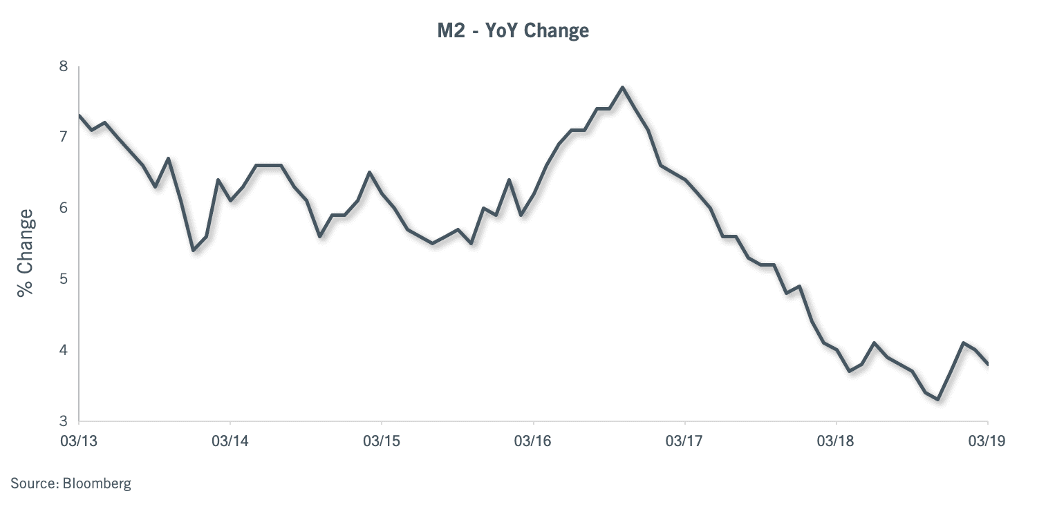 For the first quarter recovery (and possibly well into 2019), the absence of two negatives is a positive. With the Fed on hold, money supply growth can revert to more organic levels. These are not very high, however, with M2 growth averaging about 4% so far in 2019, versus levels in the upper 3% range in late 2018. That is not much of a difference, but it is an improvement. The progression of money supply growth will probably need to accelerate to keep stocks going beyond this recovery phase. The perception of policy stability ought to matter in terms of accelerating credit creation and therefore money supply growth.
2018 represented one of the worst years on record in terms of aggregate global financial futility. Practically nothing worked, and practically everything lost money, from U.S. stocks and bonds to international stocks and bonds to international currencies. The “winning trade” was holding Japanese Yen, a surprise in itself, as the Yen is subject to an aggressive and continued set of policies designed to cheapen its value.
 Trading thus far in 2019 looks a bit the opposite. Everything is working (except those insufferable foreign currencies). Stocks are higher, with the market favoring pro-cyclical sectors such as technology, internet stocks, and industrials. Stocks priced for a short and ugly remainder to their existences, such as automotive and traditional box retail stocks, have also rebounded considerably thus far in 2019. Looking back at last year, there was an evident “blow off top” as markets wound their way through 2018, setting the stage for desultory returns. The pronounced episodes of euphoria and despair expressed in stock prices over the past six months are not new to capital markets; that said, it does feel a bit like a yo-yo of emotions and a highly directional market.
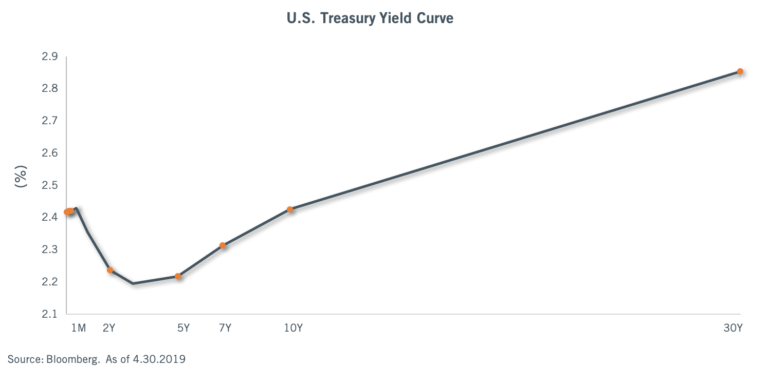 In the fixed income markets, bond prices are higher – but the intellectual reasoning is a good deal different. The change in Federal Reserve communications led to some degree of repositioning of interest rate expectations. While we thought the Fed’s “dot plot” model for 3-4 rate increases in 2019 implausible, markets evidently did not – until communicated otherwise in the first quarter. The resultant shift pulled the rug out from 2019 rate expectations and led various bets on the longer-term shape of the yield curve to be pulled. For much of the fourth quarter, there was a mini-inversion in parts of the U.S. Treasury yield curve between 2-5 years, with a modest positive slope between the more widely watched 2-10 spread as well as the Fed Funds to 10-year spread. The latter briefly inverted outright in the wake of the March Fed meeting. At present, the intermediate part of the curve bears a modest inversion, but the whole of the curve is not inverted. Yield curve inversions have a strong track record of forecasting recessions about 1-2 years ahead of the actual event, making the partial inversion an either interesting or misleading predictive factor. The bull case is that the Fed Funds rate is about 50 bps too high, and that it should/would be lowered to the 2.0%/neutral range in about a year. Our sense is that the behavioral hurdle to actually lowering the rate is probably some degree of economic financial stress. For now, this glass also appears to be half full to markets.
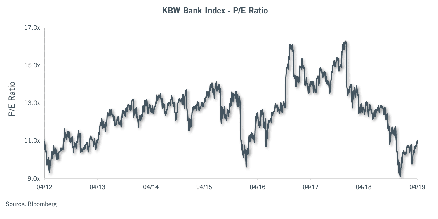 Bank stocks, whose earnings are sensitive to the spread between short rates and longer rates, took a hit late in the first quarter, owing to the decline in longer yields and the partial inversion visible in the above chart. Banks remain up for the year, but still well off their 2018 highs. Banks generally trade at lower P/E multiples than the broader markets due to cyclical sensitivities, but have seldom traded as cheaply as they do now; the forward P/E multiple of just under 11x for banks is a 38% discount to the 17x range assigned to the broad U.S. stock market. For context, a more normal discount is in the 20%-25% range. Our general view is that the discount in financial stocks is overly negative, but we have begun to shift our financial exposures to somewhat less credit-sensitive positions as and where opportunities reside. Credit losses for investors have been very low for several years now, and markets are not likely to be forgiving when and if credit losses begin to rise. That is largely a cyclical and cynical call, but in our view a correct forecast in terms of how to be positioned.
Outside the U.S., yield curve signals are harder to parse. Yields declined globally in the first quarter, and trillions of dollars worth of bonds globally (mostly Europe and Japan) have reverted to negative yields last seen in the summer of 2016. The European Central Bank pushed out any changes to its negative interest rate policy (NIRP) until 2020 in all probability, while Japan’s Central Bank seems stuck in an ongoing balance sheet expansion that has seen it remove most long-dated bonds from circulation and encompass some ~70% of Japanese equity index ETF volumes. This calls into question the pricing of Japanese financial markets to a degree. It is disquieting to observe these two major central banks unable to exit emergency policies, explaining in part the deep discount of international stocks versus U.S. equities. A couple of years ago, I would have emphatically concluded that an exit from unconventional policies such as NIRP was a matter of time for the Europeans and even eventually Japan. Today, who can be certain? Eventually and in due course, which means…nobody really knows. It’s not a good look, and seems apt to continue to constrain multiples.
This concludes our prognostications. The Fed appears off the table for the balance of 2019 – good. The market does not take a fullscale trade war seriously – good. The yield curve is partially, but not fully, inverted – a mixed signal. Negative yields abound outside the USA – not good. Unconventional monetary policy seems to have run its course, and yet ECB and JCB exits appear challenged – not good. Money supply growth, which seems to have had a large hand in last year’s poor results, is better at ~4% than low 3%, but is not really accelerating much. That’s also a mixed signal for financial markets, particularly after a large advance.
Our sense is that if enough of these variables will stay mixed to positive, markets should hold up adequately. If one or several turn south, not so much. The interesting question, particularly in the wake of a waterfall decline in 4Q 2018, is how markets will handle another bout of stress?
Shallow Market Hypothesis
The (not so) Brave New World of Thinner Markets, Erratic Price Discovery, and Decreased Liquidity
The sizable stock price declines of late 2018 and rapid recovery in early 2019 illustrate an increasingly self-evident feature of modern financial markets: there are far fewer traditional investors in the marketplace. They have been replaced with the faceless flows of index funds, quant funds, and paired-risk strategies who tag along on the back of the information processing, profit-seeking, and price discovery of active investors. As of this writing, the active/passive split is purported to be about 50/50 in terms of actual shares held by passive or active strategies, with the share of passive edging progressively higher from one quarter to the next. My hypothesis is that this dynamic understates the impact of the meaningful de-forestation of the active equity investor landscape – leading to a variety of unintended consequences.
The features of a structurally shallower market for active investors include:
- A much more volatile “price discovery” process for individual stocks,
- A higher frequency of stock market “squalls” that lead to assorted price dislocations (i.e., flash crashes),
- More random stock price movements and cross-stock correlations due to the concentration of investors in index and sector-ETF vehicles,
- A market that is generally less reliable in its capacity to provision liquidity in times of stress, and
- Overall, a less dependable marketplace in terms of the accuracy of pricing signals.
The above lead to two distinct challenges for investors:
- Individual stock and/or asset allocation decisions may be theoretically correct, but overwhelmed by volatility events in a shallower market. Asset allocation decisions implemented in 2018 is a stark reminder on this front.
- Second, the asset allocation framework probably needs some amendment. Investors face not one but two forms of systemic risk, the markets themselves, and market structure.
To shorten your read, the upshot of a shallower market is not a lot different from “the small-cap effect”. This refers to the challenges of stock pricing and liquidity in smaller stocks. Large buyers or sellers can move small cap stocks significantly in a short window of time. When a large investor or two elects to vacate a name, the valuation compression can be significant, as bringing the stock price down to a low enough level as to cause new buyers to emerge and clearing the marketplace can be a daunting (and very inexact) process. Liquidity, price discovery, and the behavior of stocks to changes in available information are inherently inexact processes. We see the small-cap effect working its way well up the capitalization spectrum, to larger and theoretically more efficiently valued/liquid names. What’s the solution? Dedicated small cap investors understand that liquidity is fragile and price swings can be violent in this corner of the market, and may often hold a higher percentage of portfolio cash in happier times to prepare for the inevitable choppier periods. Given the pace and frequency at which liquidity disruptions can envelop larger stocks, we believe a similar mindset is in order.
On a given day, over 90% of volume in any given stock is not fundamental investors electing to buy or sell a specific name, but the buying or selling of baskets and intraday trading related to passive and/or quantitative strategies1. This thinning out of the marketplace means that investors motivated to buy or sell a specific stock because of a change in their view of it (i.e., acting on “new information”) will find that the cost to implement their decisions has gone up, in many cases by a considerable margin. “Liquidity” has a specific meaning in the context of stock markets. The old school definition of liquidity, which reflected market depth, is relevant. It’s not the daily average volume per se, and not the commission cost to trade shares. Before decimalization, it was the amount of buying or selling needed to move a stock ¼ of a point. This now antiquated notion presumed that investors (the regular kind) would care more about the ease with which they could change their minds about a specific position. In a less-passive world, an increase in a stock price because of buying pressure would bring out the sellers. But not so when most volume has no reaction to price. That traditional liquidity cost has gone up, as the price of expressing new information, whether good or bad, means motivating an increasingly small subset of daily trading to take the other side.
Drag Alongs and Tag Alongs
Modern securities law features the concept of “tag along” rights for minority shareholders to participate in stock takeovers or other major corporate actions, and not be forced into accepting a lower bid for their shares. In parallel, majority shareholders generally enjoy “drag along” rights that prevent a small minority of shareholders from blocking corporate actions such as a change in control. With passive “tag along” shareholder flows and basket trades representing the vast preponderance of trading volume on a given day, this concept probably needs to be updated to reflect how stocks will move in general. Given the sheer size of indexed funds, traditional investors are in effect, dragged along by index flows and which stocks of theirs belong to the sector ETF that may be used to gain or hedge an exposure. For investment professionals (such as myself) whose careers date back to the 20th century, the current market structure is simply not the same. While trading costs are infinitesimally lower, not only is the true cost of liquidity higher, but there is a whole new form of risk. How do you price the risk of the market structure on top of transitional systemic risks?
The efficient-market hypothesis (EMH) that underpins much of the theoretical basis for indexing requires that agents have rational expectations and seek to maximize their own utility. The investing population is correct (even if no one person is), and agents update their expectations appropriately as new information appears. EMH allows for individual agents to be irrational; when faced with new information, some investors may overreact and some may underreact. All that is required by the EMH is that investors’ reactions be random and follow a normal distribution pattern so that the net effect on market prices cannot be reliably exploited to make an abnormal profit.
What to Expect in a Shallow Markets Hypothesis (SMH) World?
A revised CAPM model of risk/return
In an SMH-bound world, not all agents in the market have “rational expectations”, or update their views of stocks to reflect new information. In fact, a large component have no specific expectations or information about stocks, and have assigned this role to the market (and essentially to other investors). The pool of traditional investors that are profit-seeking and do take the time to update their expectations is small in relation to the flock of passives. Accordingly, in times of stress, their capacity to provide liquidity is limited relative to passive flows. Like global warming, this (seems likely) to become worse before it gets better. If passive flows themselves experience a change in information, such as Presidential tweets or central bank actions, the price of liquidity/market clearance may be high. There will be a non-normal distribution of trading days when these market structure squalls create outsized trading opportunities in individual names. Profit-maximizing investors will need to provision some liquidity to take adequate advantage of such periods.
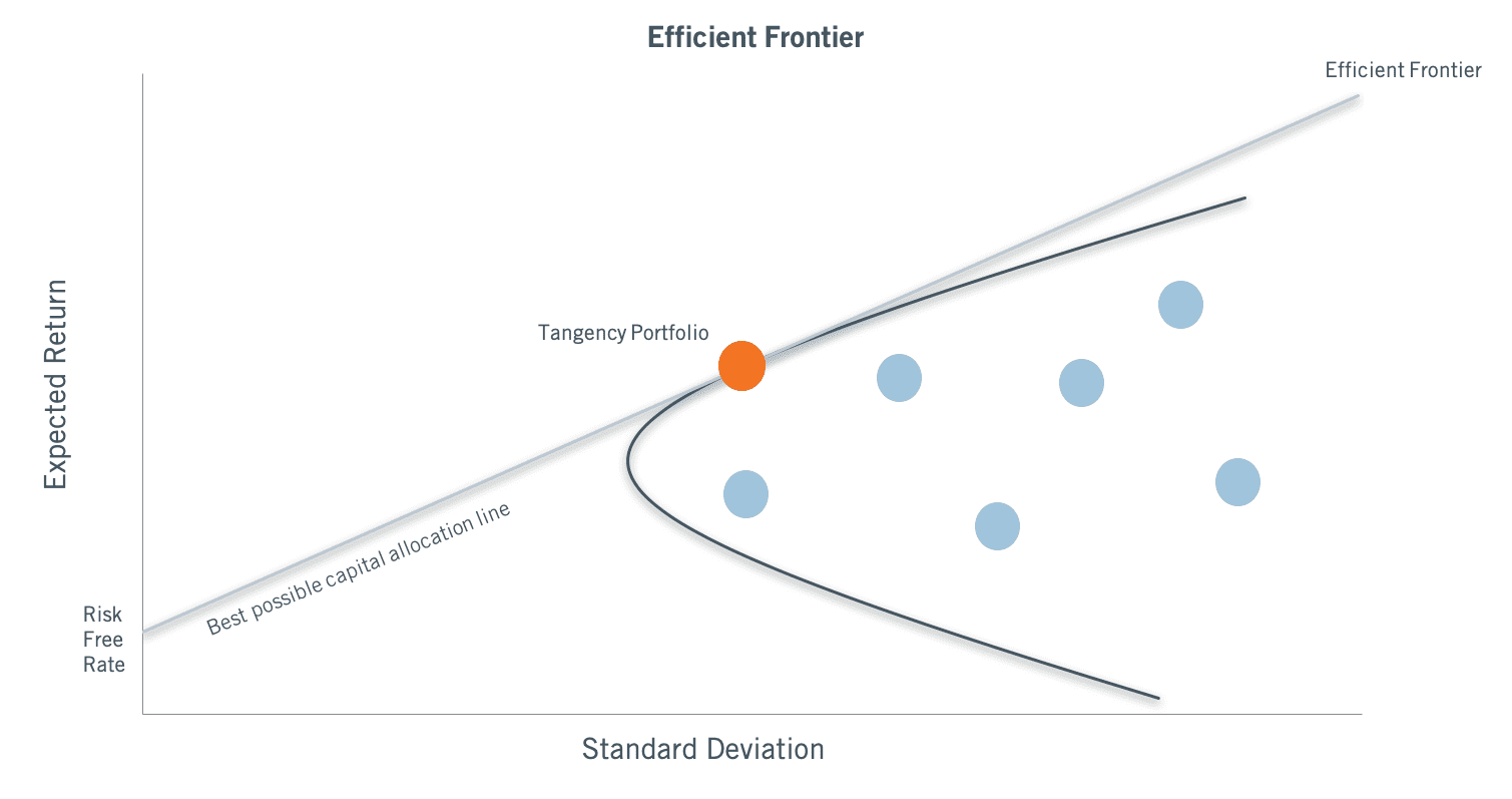 The EMH and modern portfolio theory are closely linked. In modern portfolio theory, risk-averse investors can construct portfolios to optimize or maximize expected return based on a given level of market risk. Risk is an inherent part of higher reward. According to the theory, it’s possible to construct an “efficient frontier” of capital allocation offering the maximum possible expected return for a given level of risk. This theory was pioneered by Harry Markowitz in 1952.
Individual stocks and portfolio manager return evaluations are bound up together in an equation taught to finance students in first-year textbooks, the Capital Asset Pricing Model, or CAPM. It goes:
Expected Return = risk-free return + β x (market return – risk free return)
To evaluate investment manager performance, the CAPM equation is edited slightly. Returns are a product of a manager’s portfolio alpha, or non-market specific return, plus the market-linked beta.
In a CAPM-governed world, all stocks ought to be priced in a clear relationship to their risk, which is generally price as volatility. As for alpha – this may not really exist if the EMH holds true in strong form, but it’s assumed that surely some form of alpha lies out there for the right portfolio construction. Portfolio management careers are made or broken based on how effectively some form of alpha measurably results.
In a shallow market, market participants contend with two forms of risk. One is the traditional “market” form of risk expressed above. The second is a “market structure” form of risk, where individual stock price returns depend not just on the actions of traditional market “agents,” but also on the actions or inactions of the tag along passive actors. For big household name stocks like Apple, Disney, Visa, or Caterpillar, there may be more than enough traditional investors to drown out the market-structure risk. But as you move down the capitalization spectrum, market sructure becomes a greater controlling factor. In effect, CAPM needs to be restated as:
Expected Return = Rf + β1 x (market return – Rf) + β2 x (market structure return – Rf), where
Rf = Risk-free rate
β1 = Market Beta
β2 = Market Structure Beta
The implications from a CAPM perspective may be that the added “market structure” form of Beta just adds to risk, or alternatively for evaluating portfolio managers, alpha may not be uniquely separable from the two forms of beta. Having theorized about the implications of shallower markets and the variances in pricing signals, there might be differing efficient frontiers or definitions of risk, but we are not clear exactly how to contemplate them.
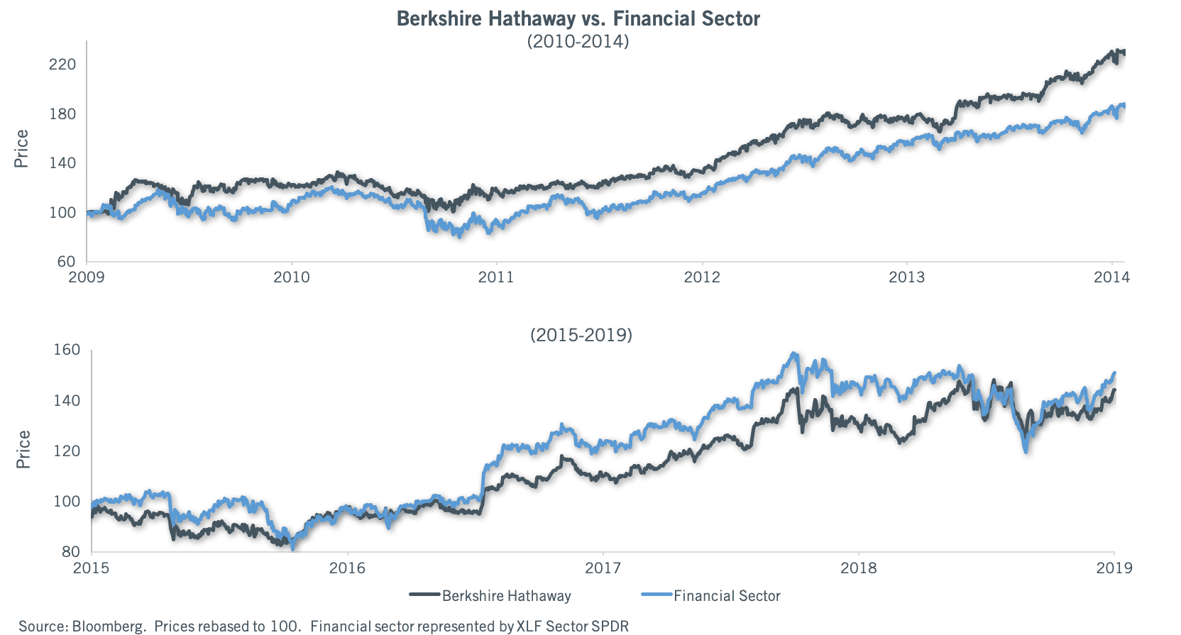 Even among the very biggest of stocks, the more pronounced impact of market structure and correlation are visible. While we can’t really explain why, it seems market structure-related correlations accelerated in the 2014-15 time frame. Consider a gigantic stock that is classified as a financial, Berkshire Hathaway. It marched largely to its own beat from the market lows to 2014. From 2015 onwards, it moves almost tick for tick with a financials stocks ETF, which is far more sensitive to bank credit, the yield curve, etc than Berkshire’s diversified range of holdings. Maybe it’s become inevitable as Berkshire is a market proxy given its size, but the increase in correlation is surprising.
Proof?
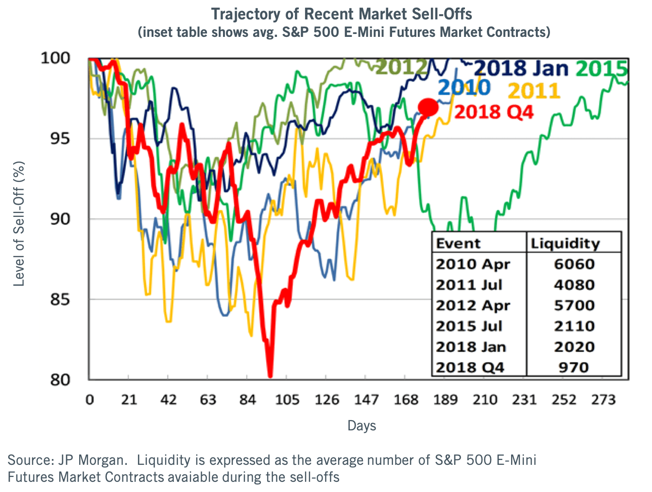 During the first quarter, a variety of strategists whose work we receive offered their own assessments of the market action in 2018 and recovery potential in 2019. One particular chart caught my attention, showing not just the severity of the Q4 2018 market decline, but how much less market-related selling pressure led to the event in terms of e-mini futures contracts. The Shallow Markets Hypothesis has been a working thought project of mine for some time. This piece is the result of having “caught one in the wild” so to speak, in terms of a market event that could only be explained by much thinner market composition.
Expect More Squalls?
Our work points to an increasing propensity for sudden and severe moves down in stock markets in the current decade versus prior decades. Markets do go down for a number of fundamental or structural reasons – wars, recessions, depressions, financial crises, central bank policies. It’s the change in frequency that is notable.
First, some definitions:
- “Sell-off” = stock market loss >5%.
- “Correction” = stock market loss of about 10%. A correction would also be a sell-off, but not all sell-offs would be corrections.
- “Major correction” = loss of about 15%. Same as the above, all major corrections are corrections, but not all corrections are major.
- “Bear market threshold” = loss of ~20%, but not worse than 25%.
- “Crash” = Something worse than -25% loss in a more or less straight line, a la 2008 or 1987.
All of these market-decline definitions are characterized differently from a true bear market, which tends to be more of multi-quarter process as opposed to a sharp market action. A true bear market would contain many of/all of the above sell-down legs, but the main difference versus a bull market is the recoveries are smaller than the sell-offs, leading to net negative performance.
During the entire 2009-present bull market period, one can observe the following sporadic sell-off events in large-cap stocks:
- an 8% sell-off May-July 2009,
- a 15% major correction May-July 2010 (the flash crash),
- a 20% bear market threshold decline in July/August 2011, a subsequent 9% correction in 4Q 2011,
- a 10% correction in 2Q 2012,
- a 9% pre-election correction in 2012,
- a 9% correction in the fall of 2014, which preceded the onset of the oil crash,
- a 12% fast correction in 3Q 2015,
- a 14% major correction from about Christmas 2015 to early Feb 2016.
- a 6% sell-off in summer 2016 (Brexit),
- a 5% pre-election sell-off in October 2016,
- a 10% correction in February 2018, and
- a 20% threshold bear market from September 2018-December 2018.
Items 7-9 formed a true bear market in small caps, commodities, and EM stocks in the 2014-16 time period.
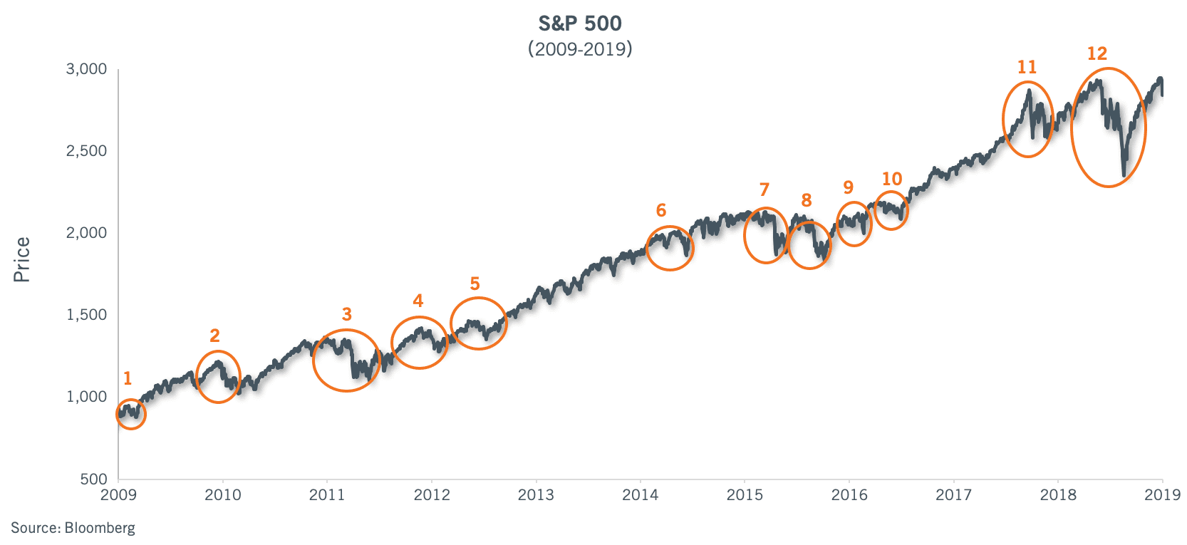 These are for the S&P 500 index; a total of 13 events in a 10-year time frame of exemplary aggregate market performance, or one every 9 months. There are two notable long periods devoid of material sell-offs: the 20 months post-2012 election, and the 14 months after the 2016 election. These may simply be odd coincidences. There are 4 major correction/bear market threshold declines, so one every 2.5 years.
Looking at the same time frame for the Russell 2000 index, there have been seven small-cap major correction/bear market threshold declines and three statistical bear markets, or about one major correction or worse every 15 months, with a statistical bear market erupting once every three years in small caps. A 27% decline in 2015-16 was more of a “real bear market” from an aggregate market behavior/value destruction perspective. 7%+ sell-offs or smaller corrections happen frequently, eight times in ten years alongside the larger events.
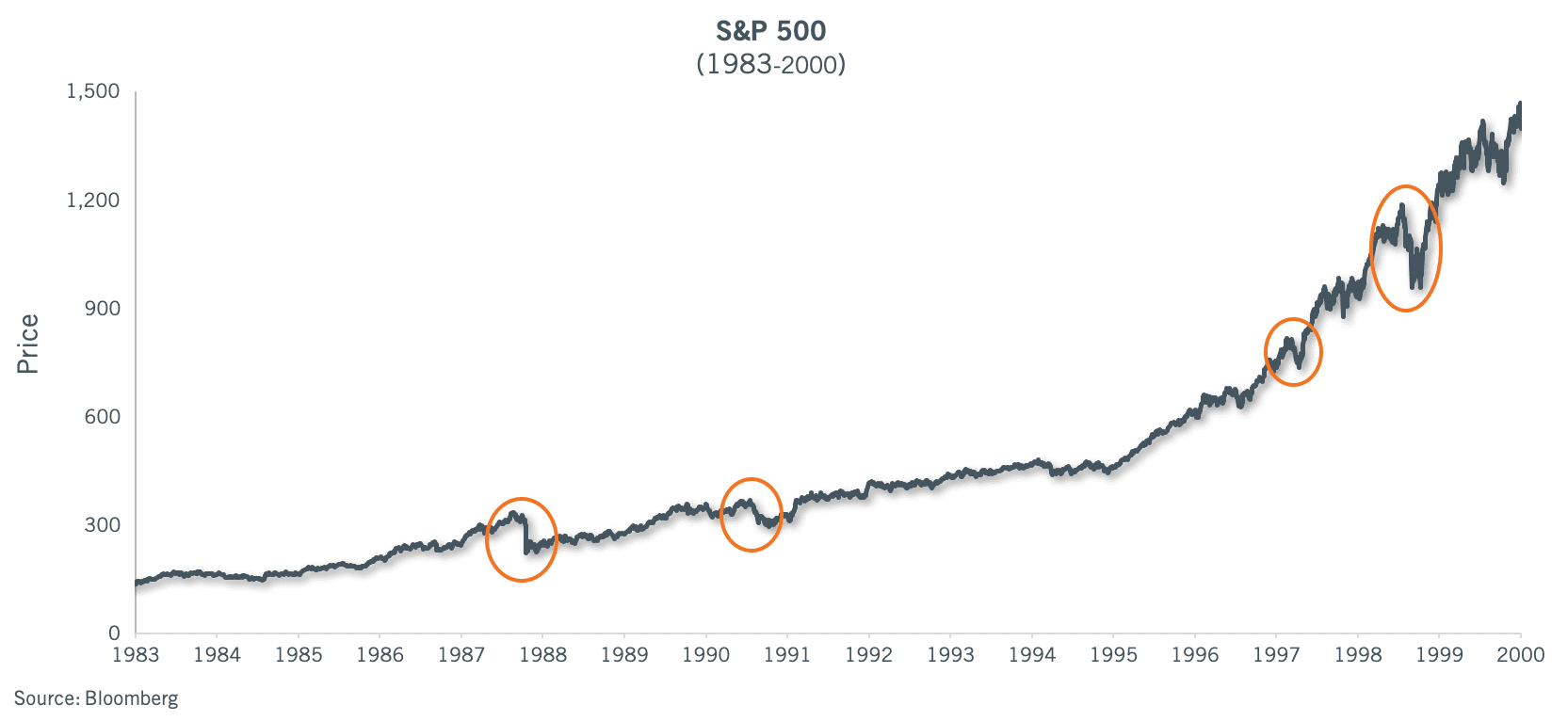 As a point of reference, the entire 1981-1999 bull market featured 11 selloffs in 19 years. Two of the selloffs, the 1987 crash (-33%), and the 1998 Long Term Capital episode (-19%) were clearly linked to/exaggerated by market structure, while another (1990-91 threshold bear market) related to a war and recession. A sub-10% selloff corresponded to the initial onset of the Asian financial crisis in 1997. So one event every 20 months, one related to a recession, and one related to a severe set of disruptions outside the USA.
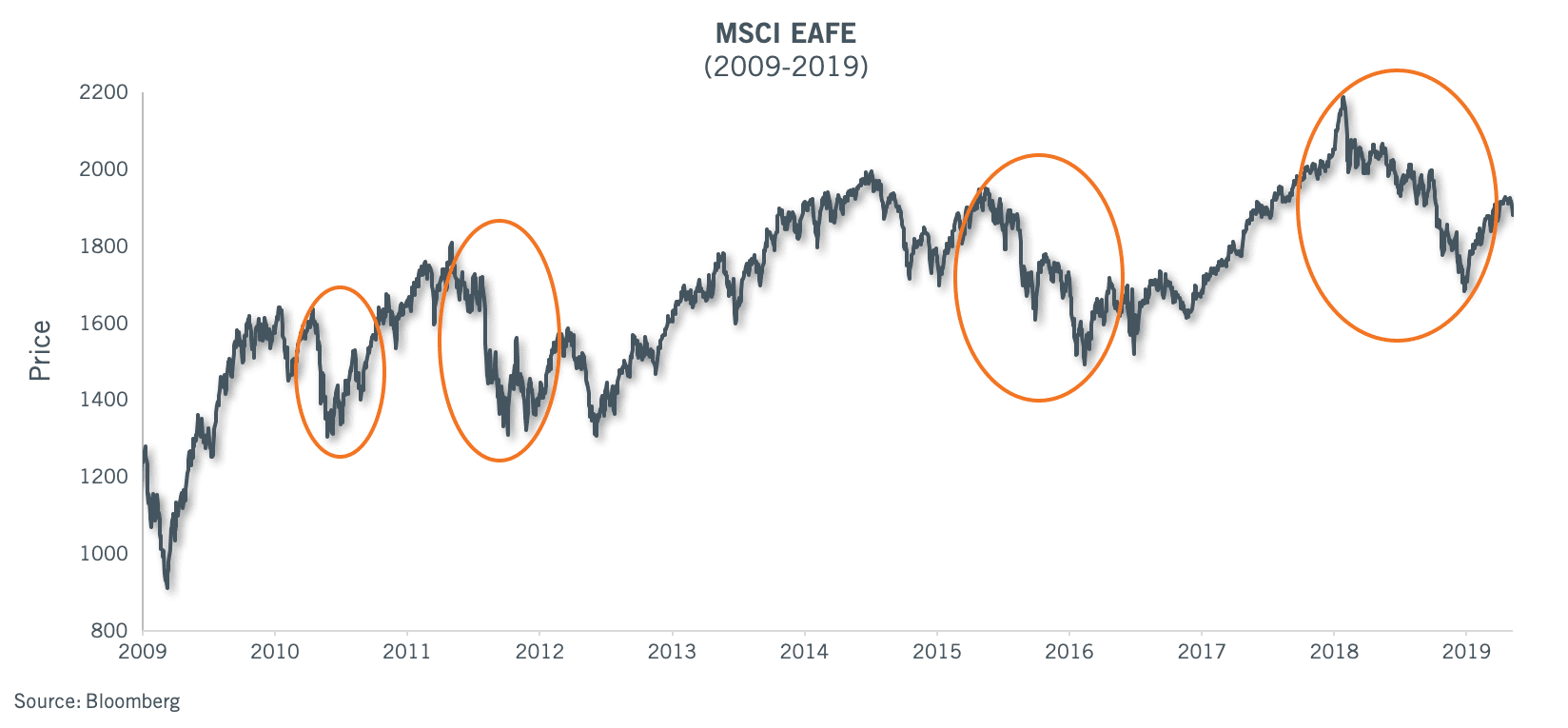 Looking at international markets, the frequency of squalls post 2009 lows is similar to those of small-cap USA stocks. Currency movements, which have tended to be unfavorable this decade for international stocks, have generally amplified the declines to include four bear markets (2010, 2011, 2015-16, and 2018), five major corrections not as legs of a bear market, and several other moderate selloffs along the way. So a total of 21 events in 10 years, or one about every 5 months.
Conclusion
The SMH leads to a couple of intuitive results. With heightened stock price correlations and episodic volatility bouts to be expected, day-to-day portfolio management perspective may include some commitment to sustaining a higher cash level as a % of the portfolio, with the aim of rapidly deploying cash into new names and making adds to existing names during quick hitting declines, and some commitment rebuilding cash in market recoveries. While this thought might smack of market timing, it is axiomatic that market squalls will happen every few months even in positive markets, and that correlations between stocks will be high during these events, making it practically difficult to sell one name to buy another. Depending on the investment discipline, a standardized or uniform position weight model may be better at capturing investment insights, given the random liquidity dislocation and timing risks of individual stocks.
In the larger picture, shallower markets lack the investor depth to provision liquidity effectively in times of stress. This is concerning, and an irony in the context of modern finance and a heavy reliance on market efficiency. The 2018 market losses represented the worst broad market breadth since the peak of the 2008-09 financial crisis, and yet there wasn’t any appreciable credit stress. This isn’t a good formula for stability or an orderly market when real credit stress eventually hits.
As a larger and larger percentage of investment capital flows into the passive tag along mandates, and market depth evaporates further, historians might ask what led to this state of affairs? In the wake of the market declines in 2008, active management and asset re-allocation strategies between active sub styles was not effective at mitigating losses. Passive to some extent did better. This failure in the context of a broad market failure was deeply disillusioning, leading to extensive flows to passive.

Thank you for your continued confidence in Cambiar Investors.
1Source: JP Morgan
M2 – is a measure of the money supply that includes cash, checking deposits, and easily convertible near money.
KBW Bank Index – An index consisting of 24 banking stocks. The constituents of the index represent large U.S. national money center banks, regional banks, and thrift institutions. The KBW Bank Index is a benchmark stock index for the banking sector.
Certain information contained in this communication constitutes “forward-looking statements”, which are based on Cambiar’s beliefs, as well as certain assumptions concerning future events, using information currently available to Cambiar. Due to market risk and uncertainties, actual events, results or performance may differ materially from that reflected or contemplated in such forward-looking statements. The information provided is not intended to be, and should not be construed as, investment, legal or tax advice. Nothing contained herein should be construed as a recommendation or endorsement to buy or sell any security, investment or portfolio allocation.
Any characteristics included are for illustrative purposes and accordingly, no assumptions or comparisons should be made based upon these ratios. Statistics/charts may be based upon third-party sources that are deemed reliable; however, Cambiar does not guarantee its accuracy or completeness. As with any investments, there are risks to be considered. Past performance is no indication of future results. All material is provided for informational purposes only and there is no guarantee that any opinions expressed herein will be valid beyond the date of this communication.